
Color choice is not just personal taste. Knowing how color theory works in interiors gives you a scientific and psychological framework for creating rooms that feel exactly the way you want them to. The right palette can make a small bedroom feel airy, a cold hallway feel warm, or a living room feel focused and calm. Yet most homeowners pick shades they like from a swatch and wonder why the result feels off. The real discipline here is called color theory, and once you understand its core principles, every room you design will feel intentional and grounded.
Table of Contents
- Key takeaways
- How color theory works in interiors: the core properties
- Why lighting transforms your color choices
- Color harmony and the proportion rule
- Planning color across rooms and open spaces
- My honest take on color theory at home
- Build your color vision with the right pieces
- FAQ
Key takeaways
| Point | Details |
|---|---|
| Properties matter more than names | Hue, value, and saturation shape mood and space far more than a color’s label or marketing name. |
| Lighting changes everything | LRV and correlated color temperature determine how colors actually read on your walls at different times of day. |
| Proportion drives balance | The 60-30-10 rule distributes dominant, secondary, and accent colors to prevent visual chaos or flatness. |
| Test before you commit | Paint samples observed in your own room across a full day reveal shifts no store swatch can show. |
| Whole-home coherence takes planning | Anchoring a dominant color family with consistent trim unifies multi-room palettes without making spaces look identical. |
How color theory works in interiors: the core properties
Understanding color theory in interiors starts with moving past color names. “Sage green” or “dusty rose” are marketing terms. What actually controls how a color feels in a room are its measurable properties.
Here are the properties every homeowner should know:
- Hue: The pure color family. Red, blue, yellow, and all points between on the color wheel.
- Value: The lightness or darkness of a color on a scale from white to black. This single property does more for spatial perception than any other.
- Saturation: How intense or muted a color is. High saturation feels bold and stimulating. Low saturation feels soft and restful.
- Tint: A hue mixed with white, producing lighter, airier versions.
- Shade: A hue mixed with black, producing deeper, moodier versions.
- Tone: A hue mixed with gray, producing more complex, nuanced versions that tend to feel sophisticated and easy to live with.
Mood is measurable through these properties rather than hue names alone. A high-saturation red creates stimulation regardless of what you call it. A low-saturation blue-gray creates calm whether the paint chip says “mist” or “slate.”
Value is especially powerful for spatial perception. Light colors reflect light and expand a room visually. Dark colors absorb light and make a room feel cozy and contained. This is not opinion. It is physics and perception science working together.
Pro Tip: When you feel uncertain about a color, stop looking at the name and instead ask: how light is it, how saturated is it, and is it a tint, shade, or tone? Those answers tell you far more than the label.
Why lighting transforms your color choices
You can have the most thoughtful palette on paper and still end up with a room that feels wrong. Lighting is usually why.
Two concepts matter most here. The first is Light Reflectance Value, or LRV. LRV is measured on a scale from 0 (black) to 100 (pure white). Ceiling whites typically land above 85. Light, airy wall colors sit in the 65 to 80 range. Mid-tone neutrals fall between 35 and 50. Moody, saturated walls drop to 20 to 35, and deep accent walls go below 20.
Knowing a color’s LRV before you buy means fewer surprises. A color that looks like a light warm beige in the can may have an LRV of 42 and read as a medium-dark tan once it covers your four walls and the light absorption compounds.
The second concept is correlated color temperature, or CCT. This measures the warmth or coolness of your light sources in Kelvin. 4000K to 5000K lighting pushes back perceived spatial boundaries and makes rooms feel more open. Lower CCT around 2700 to 3000K produces warm, amber light that cozies a space but can shift cool wall colors toward yellow.
Here is what that means practically:
- A blue-gray paint under warm 2700K bulbs can look greenish or even brownish.
- A warm off-white under cool 5000K daylight bulbs can look clinical and stark.
- Natural daylight shifts throughout the day, moving from warm golden morning light to cool midday light and back to warm amber in the evening.
Mixing bulb color temperatures within a single room creates visual disharmony that people feel but cannot always name. Keep your bulbs consistent in CCT throughout any one room.
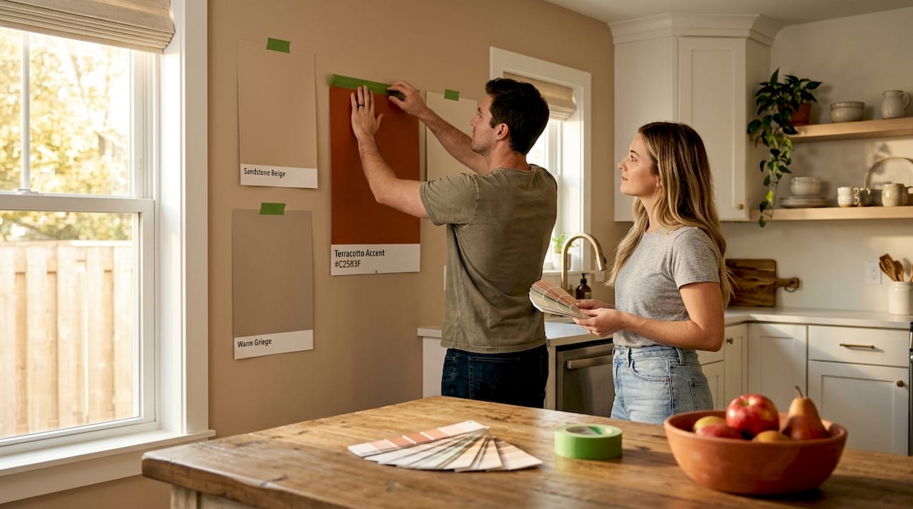
The single best thing you can do before committing to a paint color: Buy peel-and-stick paint samples, apply them to multiple walls in your actual room, and observe color shifts from morning through evening under both natural and artificial light. What you see in a store will never match what you live with.
Color harmony and the proportion rule
Color harmony in interiors is not about colors that “go together” in a vague, intuitive sense. Harmony involves structural logic between hues maintained across lighting and viewing distances. Designers validate it through frameworks built on the color wheel and room architecture together.
The three most useful harmony structures for home design are:
- Complementary: Colors opposite each other on the color wheel. Blue and orange. Purple and yellow. High contrast and energetic. Works beautifully for accent relationships.
- Analogous: Three or four colors sitting adjacent on the color wheel. Blue, blue-green, and green. Cohesive and restful. Ideal for bedrooms and living rooms where calm is the goal.
- Triadic: Three colors evenly spaced around the wheel. More complex and vibrant. Requires careful saturation control to avoid visual noise.
Once you have a harmony structure, proportion determines whether it works or overwhelms.
| Color role | Proportion | Typical application |
|---|---|---|
| Dominant | 60% | Walls and large fixed surfaces |
| Secondary | 30% | Sofas, rugs, major furniture |
| Accent | 10% | Pillows, art, small decor objects |
The 60-30-10 proportion rule is not rigid, but it solves one of the most common design failures: too much of a good thing. A room that is 80% one color feels flat. A room where every surface competes equally feels chaotic.
Visual weight also plays a role within these proportions. A highly saturated accent at 10% reads just as powerfully as a muted secondary at 30%. You may need to reduce the saturation of your dominant color if your secondary is already bold.
Pro Tip: Apply the 60-30-10 rule to the whole room, not just paint. Count your sofa, rug, window treatments, and decor. The proportions govern the visual system of the entire space.
Planning color across rooms and open spaces
Single-room color decisions are the easy part. Where homeowners often struggle is creating palettes that work across an open-plan layout or throughout an entire home without each room feeling disconnected or visually jarring.
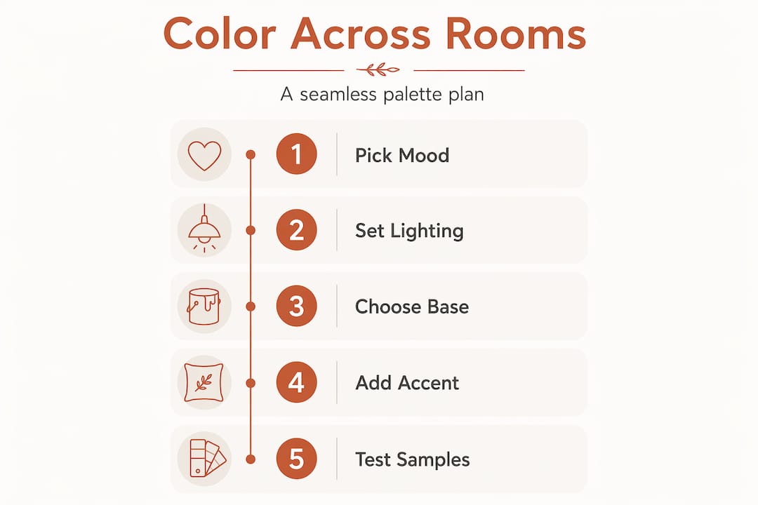
The key principle is anchoring. Whole-house coherence comes from choosing a dominant color family, keeping trim and ceiling colors consistent throughout, and using light-to-dark value variations of that family to move between spaces.
Here is how that plays out room by room:
- Trim consistency: White or off-white trim that repeats across all rooms acts as a visual thread that ties spaces together. Changing trim color between rooms creates subconscious friction.
- Value progression: Moving from a lighter version of your palette in open, social areas to a deeper version in private, restful spaces creates a natural mood shift without breaking visual continuity.
- Transition zones: Hallways and entryways benefit from mid-value neutrals that sit comfortably between adjacent rooms on both sides.
For specific moods, lighting and color work together. Relaxation zones benefit from illuminance below 200 lux and CCT in the 2700 to 3000K range. High-activity areas like home offices or workout spaces need illuminance above 500 lux and CCT between 4000 and 5000K for alertness and focus.
| Room type | Ideal CCT | LRV range | Color mood |
|---|---|---|---|
| Bedroom | 2700-3000K | 35-65 | Warm, soft, restful |
| Living room | 3000-3500K | 50-75 | Balanced, welcoming |
| Home office | 4000-5000K | 55-75 | Cool, clear, focused |
| Workout space | 4000-5000K | 50-70 | Energizing, motivating |
One detail most people overlook: material finishes shift how a color reads. Matte versus gloss surfaces affect perceived color LRV by 8 to 12 points. A gloss finish reflects light and makes a color read lighter and more saturated. A matte finish absorbs light and makes the same color look deeper and quieter. Factor this in when you choose paint sheens for walls versus trim. If you are designing a home gym or fitness space, this is especially worth noting since equipment colors and flooring finishes all contribute to the room’s overall color balance.
My honest take on color theory at home
I’ve worked with color principles long enough to say this plainly: the biggest trap most people fall into is becoming fixated on a specific color name rather than understanding what that color is actually doing.
I’ve seen homeowners spend weeks debating between two shades of green, only to realize once the paint dried that the real problem was value. Both colors were mid-tone on a wall with poor natural light, and neither would have worked without addressing the lighting first.
What I’ve learned is that color theory is architecture. It is not decoration. The way light, value, saturation, and proportion interact in a real room is the structure of your space’s atmosphere. Get that structure right and even modest color choices feel considered and intentional.
Testing colors in your own room, at different times of day, is something I cannot recommend strongly enough. Sampling paint in your actual space reveals context no swatch can give you. I have seen colors that looked perfect in a store feel anxious and cold at home simply because of how afternoon light fell on that particular wall.
The 60-30-10 rule is a great starting point, but treat it as a compass, not a contract. A room with unusual proportions or high-contrast architectural features may need a completely different ratio to feel right. Trust the principles, not the numbers themselves.
View color as something you set up intentionally, the way you would arrange furniture for flow. When you start thinking that way, every decision becomes clearer and more confident.
— Brian Dunn, Couch & Dumbbells
Build your color vision with the right pieces
Ready to put these principles into practice? The right furniture and decor make all the difference when you are trying to achieve a balanced color scheme.
At Couchanddumbells, the home and interior collection is curated with proportion, tone, and lifestyle in mind. Whether you are sourcing a statement sofa to anchor your secondary 30%, looking for accent pieces that add that final 10%, or simply refreshing a room with intentional decor, you will find options that are designed to work together. The collection reflects the same mindset this article is built on: that beautiful, intentional living spaces are not accidental. They are planned, purposeful, and absolutely within your reach.
FAQ
What is the most important color property for a room’s mood?
Value, which is the lightness or darkness of a color, has the greatest impact on mood and spatial perception. Light values expand and energize; dark values create intimacy and calm.
How do I use the 60-30-10 rule in a room?
Apply 60% of your dominant color to walls and large surfaces, 30% to major furniture pieces like sofas and rugs, and 10% to accent decor such as pillows, art, and small objects.
Why does my paint color look different at home than in the store?
Lighting conditions, including your room’s natural light and bulb color temperature, shift how a color reads. Paint samples at home observed throughout the day give you the accurate picture.
What LRV should I choose for a small room?
For a small space, aim for wall colors with an LRV between 65 and 80. Higher reflectance bounces more light around the room, making it feel larger and more open.
How do I create a cohesive palette across multiple rooms?
Anchor your palette with a consistent trim color throughout your home and use light-to-dark value variations of the same color family to transition naturally between spaces.