

A living room color palette is a structured system of three coordinated colors that define your space’s mood, depth, and visual comfort. The best living room color palette ideas follow a clear temperature direction, either warm or cool, and distribute color across dominant, secondary, and accent roles. The 60-30-10 rule is the industry-standard framework professional designers use to achieve this balance. Getting this foundation right makes every other design decision, from your sofa to your curtains, fall into place naturally.
1. What is the 60-30-10 rule for living room color palettes?
The 60-30-10 rule is the most reliable framework for building a balanced color palette in any living room. It divides color into three roles: 60% dominant, 30% secondary, and 10% accent. This structure prevents visual chaos and gives your eye a clear place to rest.
Here is how each role works in practice:
- Dominant color (60%): Your walls, large area rug, or main sofa. This color sets the room’s overall tone.
- Secondary color (30%): Curtains, accent chairs, or a loveseat. This color adds depth without competing with the dominant.
- Accent color (10%): Throw pillows, artwork, vases, and small decorative objects. This is where personality lives.
The rule also requires that every element belongs to the same temperature family. Warm colors include creams, taupes, terracottas, and golden yellows. Cool colors include grays, blues, greens, and crisp whites. Mixing temperature families without intention is the fastest way to make a room feel off.
Pro Tip: In a small living room, apply the 60-30-10 rule but keep your dominant color lighter than you think you need. Light dominants push walls outward visually and make compact spaces feel more open.
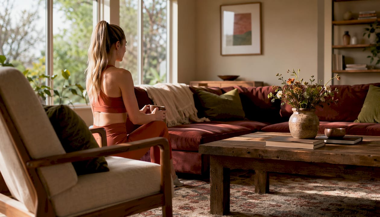
2. Seven living room palette families and how they affect mood
Seven distinct palette families cover the full design spectrum for living rooms, from soft and airy to bold and moody. Each family has a defined temperature direction and a specific emotional effect.
- Warm Neutral: Creamy whites, warm beiges, and soft taupes. This palette feels calm and welcoming. It suits rooms with warm wood floors and south-facing light.
- Cool Gray and Blue: Soft grays paired with dusty blues or slate. This palette reads as polished and restful. It works best in north-facing rooms where natural light is cooler.
- Earthy Warm Tones: Terracotta, rust, and ochre with warm white accents. This palette is grounded and textured. It pairs naturally with rattan furniture and linen textiles.
- Soft Green: Sage, moss, and muted olive tones. Green sits at the intersection of warm and cool, making it one of the most forgiving palette families. It promotes calm and works in most lighting conditions.
- Bold and Moody: Deep teal, charcoal, or navy as the dominant color. This palette creates drama and intimacy. It requires good natural light or layered artificial lighting to avoid feeling heavy.
- Light and Airy: Warm white walls with soft blush or pale gold accents. This palette maximizes brightness and feels effortless. It suits open-concept spaces and rooms with large windows.
- Classic Blue and White: A timeless cool palette with navy or cobalt as the secondary color. This combination reads as crisp and structured. It suits both traditional and modern interiors.
The warm vs. cool temperature direction you choose shapes every textile, hardware finish, and flooring decision that follows. Picking a family first simplifies the entire process.
3. How to choose the right palette based on lighting and room layout
The best color for your living room is always contextual. Natural light orientation, undertones of fixed elements, and desired mood determine which palette actually works in your specific space. A color that looks perfect in a showroom can feel completely wrong in your home.
Key factors to assess before choosing your palette:
- Light orientation: South-facing rooms receive warm, golden light all day. They can handle cool palettes without feeling cold. North-facing rooms receive cool, diffused light and need warm palettes to feel inviting.
- Flooring undertones: Warm-toned wood floors pair best with warm neutrals or warm whites. Pairing a cool gray wall with honey-toned oak floors creates a visual clash that no amount of styling fixes.
- Furniture style: Mid-century modern pieces often have warm wood tones and suit earthy or warm neutral palettes. Contemporary furniture with chrome or black metal hardware suits cool gray and blue palettes.
- Room shape: Open-concept spaces benefit from a consistent palette carried across zones. Enclosed rooms can handle bolder, darker dominants without feeling oppressive.
Contrast between surfaces also matters. Rooms with little value difference between walls and furniture feel flat and undefined. Aim for enough lightness and darkness variation to give the room structure.
Pro Tip: Pull a paint chip from your shortlist and tape it to the wall. Live with it for 48 hours across morning, afternoon, and evening light before committing. Paint looks different at every hour of the day.
If you are also planning a fitness corner in your living room, the color palette for active spaces follows the same temperature rules but benefits from slightly higher contrast to keep the zone feeling energized.
4. Trending living room hues in 2026
The dominant trend in 2026 is warmth. Warm whites, warm neutrals, warm taupes, warm greens, and tobacco brown are leading the shift away from the cool, sterile palettes that defined the previous decade. Homeowners want rooms that feel cozy and lived-in, not clinical.
| Trending Color | Temperature | Best Paired With | Room Type |
|---|---|---|---|
| Warm white | Warm | Natural linen, warm wood | Any size |
| Warm taupe / greige | Warm | Cream accents, brass hardware | Open-concept |
| Smoky teal | Cool-leaning | Warm wood floors, natural light | Medium to large |
| Tobacco brown | Warm | Terracotta, off-white | Enclosed rooms |
| Muted sage green | Neutral | Warm white, rattan | Any size |
Bold colors like teal and tobacco brown work best when paired with warm wood floors and strong natural light. Used without those anchors, they can feel heavy rather than rich. The trend toward warmth also aligns with the 60-30-10 rule: warm neutrals make ideal dominant colors because they recede visually and let secondary and accent colors do the expressive work.
5. Common mistakes homeowners make with living room color schemes
Most color mistakes happen before a single paint can is opened. Skipping the foundational decisions creates problems that no amount of accessorizing fixes.
The most frequent errors include:
- No defined temperature direction: Mixing warm and cool tones without a clear plan produces a room that feels unsettled. Decide on warm or cool first, then select every element within that family.
- Colors too close in value: A 20–30% contrast difference in lightness between walls and furniture is needed for visual definition. When everything is the same mid-tone, the room looks flat.
- Ignoring fixed elements: Your flooring, trim, and built-ins are not changing. Choosing a neutral paint with undertones that clash with existing flooring is the most common reason a room feels visually wrong, even when the individual colors are beautiful.
- Overusing bold colors: A bold dominant color without enough light neutrals to balance it becomes exhausting to live with. Reserve bold choices for the secondary or accent role unless your room has exceptional natural light.
- Choosing colors from a screen: Digital displays shift color temperature. Always evaluate paint samples physically in your room.
Pro Tip: Paint at least a 12-by-12-inch sample directly on the wall, not on a piece of paper. Paper samples curl and reflect light differently than a flat wall surface.
If your living room doubles as a workout space, blending fitness equipment with your decor is easier when your palette uses a warm neutral dominant. Neutral walls make equipment less visually dominant and keep the room feeling cohesive.
Key takeaways
A cohesive living room palette requires a defined temperature direction, the 60-30-10 color distribution, and at least 20–30% contrast between walls and furniture to create depth and visual harmony.
| Point | Details |
|---|---|
| Define temperature first | Choose warm or cool before selecting any specific color to align all elements. |
| Apply the 60-30-10 rule | Assign 60% dominant, 30% secondary, and 10% accent to every palette. |
| Match fixed element undertones | Align paint undertones with flooring and trim to avoid visual clashes. |
| Build in contrast | Maintain a 20–30% value difference between walls and furniture for depth. |
| Follow 2026 warmth trends | Warm whites, taupes, and tobacco brown are the leading palette choices this year. |
Temperature clarity changed how I think about color
I used to approach color selection the way most people do: fall in love with a paint chip, buy a sample, and hope for the best. The results were inconsistent. Some rooms worked beautifully. Others felt slightly wrong no matter what I added to them.
The shift came when I started treating temperature direction as a non-negotiable first decision. Before I look at a single color, I identify whether the room’s fixed elements, its floors, trim, and light quality, pull warm or cool. That one decision narrows the field dramatically and makes every subsequent choice easier and more confident.
The 60-30-10 rule reinforced this for me. Once you assign a role to each color, you stop second-guessing whether something belongs. If your dominant is a warm taupe, your secondary should be a warm linen or soft terracotta, and your accent can be a deeper tobacco or a muted brass. The system does the thinking for you.
My honest opinion: chasing trends is fine as long as you apply them within a structured palette. Tobacco brown and smoky teal are genuinely beautiful in 2026, but they only work when the rest of the room is built to support them. A trendy color dropped into an unplanned palette still produces a room that feels off. Get the structure right first, then let the trends inspire your accent choices.
— Brian Dunn, Couch & Dumbbells
Your living room palette, fully furnished
Color sets the mood. Furniture and decor seal it. Once you have your palette locked in, the next step is finding pieces that honor those choices.
Couchanddumbells carries a curated selection of home and interior furnishings designed to complement warm neutrals, earthy tones, bold moody palettes, and everything in between. From sofas and accent chairs to storage and decor, each piece is chosen with both aesthetics and function in mind. Whether your palette is a soft sage and linen combination or a rich tobacco and terracotta scheme, you will find pieces that fit without compromise. Shop the full collection and bring your color vision to life with furniture that belongs in the room you have designed.
FAQ
What is the 60-30-10 rule in interior design?
The 60-30-10 rule divides a room’s color into three roles: 60% dominant, 30% secondary, and 10% accent. It is the standard professional framework for achieving visual balance in any living room color scheme.
How do I choose the best colors for my living room?
Start by identifying your room’s temperature direction based on its natural light and existing fixed elements like flooring and trim. Then select a dominant, secondary, and accent color within that temperature family using the 60-30-10 structure.
What are the most popular living room colors in 2026?
Warm whites, warm taupes, greiges, muted sage greens, and tobacco brown are the leading choices in 2026. Cool, sterile palettes have given way to warmer, cozier hues that create inviting, lived-in spaces.
Why does my living room color look different on the wall than on the chip?
Paint color shifts with light conditions throughout the day. A color that reads warm in a store can appear cool in a north-facing room. Always test a large painted sample directly on your wall and evaluate it across morning, afternoon, and evening light.
Can bold colors work in a small living room?
Bold colors work in small rooms when used as accent colors rather than dominants. Keep the dominant color light to push walls outward visually, and reserve bold hues for pillows, artwork, or a single accent wall with strong natural light.