
Negative space decor is defined as the intentional use of empty areas around and between furniture, art, and accessories to create visual balance, highlight focal points, and improve how a room feels to live in. Also called white space in graphic design, this principle translates directly to interior design, where it shapes mood, usability, and perceived quality. Designer Tineke Triggs and platforms like LuxDeco have long championed this approach, and research confirms that applying appropriate margins and gaps can improve visual comprehension by approximately 20%. That number tells you something important: empty space is not wasted space. It is doing real work.
What is the role of negative space decor?
Negative space is the active empty area around furniture and decor that distributes visual weight and prevents clutter. The word “active” matters here. Most homeowners treat empty space as a problem to solve by adding more objects. Skilled designers treat it as a structural material, the same way an architect treats load-bearing walls.
When you crowd a room, your eye has nowhere to rest. The result is visual exhaustion and cognitive overload, two things that make a space feel stressful rather than welcoming. Tubik Studio describes negative space as the “pause that lets the punchline land,” preventing furniture from competing for attention and creating cognitive traffic jams.
Here is a quick comparison of common mistakes versus good practices:
- Mistake: Pushing every sofa and bookcase flush against the wall to maximize floor space
- Good practice: Pulling furniture a few inches from the wall to create intentional gaps that ground the room
- Mistake: Filling every shelf with objects because empty shelves feel unfinished
- Good practice: Leaving one-third of shelf space open to give displayed items room to breathe
- Mistake: Hanging art in clusters without spacing to fill a large wall
- Good practice: Using generous spacing between pieces so each one reads as a deliberate choice
- Mistake: Layering rugs, throws, and pillows until every surface is covered
- Good practice: Choosing fewer, higher-quality textiles and letting the floor or sofa show
Pro Tip: Before adding anything new to a room, remove one item first. This forces you to evaluate what is actually earning its place.
Layouts with generous negative space read as more premium and confident. Crowded designs appear rushed. That perception gap is the entire argument for restraint.
How does negative space affect mood and wellbeing?
Negative space acts as visual breathing room that creates calm and harmony no furniture or accessory can replicate on its own. This is not a soft, subjective claim. Cluttered environments are consistently linked to elevated stress levels and reduced mental clarity. Open, well-spaced rooms produce the opposite effect.
Light is the mechanism that makes this work. Too much furniture blocks shifting shadows and light patterns, making rooms feel static and flat. When you leave space open, natural light moves across floors and walls throughout the day, making the room feel alive. A bare stretch of white wall beside a window does more for a room’s atmosphere than a gallery wall in the same spot.
Tineke Triggs frames this well: negative space is the visual equivalent of a deep breath. You feel it before you consciously register it. Guests walk into a well-spaced room and immediately relax. They walk into an overfilled room and feel the urge to leave, even if they cannot explain why.
Pro Tip: Place a single lamp in a corner with nothing around it. Watch how the light pools on the empty floor. That pool of light is negative space doing its best work.
The emotional payoff of negative space’s visual calm is a sense of harmony that no amount of beautiful furniture can manufacture. You have to create the conditions for it by choosing what to leave out.
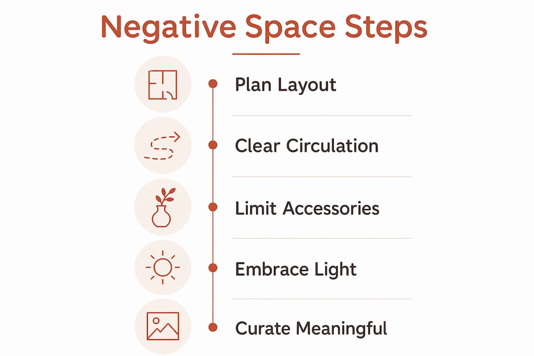
How to use negative space in your home
Applying negative space in interior design starts with layout planning, not shopping. Before you move anything, walk through each room and identify where circulation feels awkward. Poorly planned negative space hinders circulation flow; successful design uses open areas to create clear, intuitive pathways that make rooms feel larger.
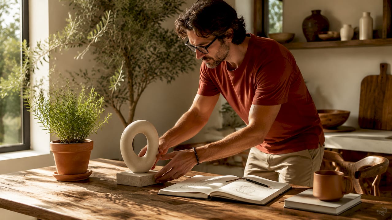
Once circulation is clear, edit your accessories. Limit surfaces to two or three meaningful objects. A single sculptural vase on a console table reads as a design choice. Six objects on the same surface read as clutter, even if each piece is beautiful on its own.
Here is a practical comparison to guide your decisions:
| Scenario | Poor Negative Space Use | Effective Negative Space Use |
|---|---|---|
| Living room sofa placement | Pushed against the wall, leaving a dead zone in the center | Floated in the room with a few inches of gap from the wall |
| Dining table styling | Centerpiece, candles, placemats, and a fruit bowl all at once | One low centerpiece with clear table surface on either side |
| Bedroom nightstand | Lamp, books, phone, water glass, and a plant all competing | Lamp and one small object, with the rest of the surface clear |
| Hallway entry | Coat rack, shoe bench, mirror, and artwork all in one zone | One functional piece and one decorative piece, with open floor |
Different design styles apply this principle differently. Mid-century modern rooms use negative space starkly, with low-profile furniture and wide stretches of open floor. Rustic interiors use it warmly, with breathing room between natural wood pieces and woven textiles. Eclectic spaces need it most, because the variety of objects demands clear gaps to prevent chaos. If you are working on a home gym or fitness space, the same logic applies: equipment placed with intention and open floor around it looks purposeful rather than crammed in.
Light-filled, neutral surfaces strengthen the effect in every style. White, cream, and warm gray walls amplify the sense of openness that negative space creates. Dark walls can work too, but they require even more discipline with furniture density.
How does negative space work across design styles?
Negative space is a universal design tool that makes a home feel curated rather than accidental, regardless of the style you prefer. The application changes, but the principle does not.
Here is how it plays out across three popular styles:
| Design Style | Negative Space Character | Common Mistake | Correct Approach |
|---|---|---|---|
| Mid-century modern | Stark and geometric, wide open floors | Adding too many accent pieces to “warm it up” | Trust the clean lines; let the furniture speak alone |
| Rustic / farmhouse | Warm and organic, breathing room between natural textures | Layering too many textiles and wood tones | Choose one dominant texture per surface |
| Eclectic | Deliberate and edited, gaps between collected objects | Treating every surface as a display opportunity | Group objects intentionally with clear space between clusters |
Tineke Triggs puts it plainly: the biggest misconception is that filling a space is the only way to finish it. Negative space requires discipline and confidence. It signals luxury precisely because most people cannot resist filling every corner.
A few style-specific do’s and don’ts worth keeping in mind:
- Mid-century: Do keep floors 40–50% open. Don’t add floor lamps in every corner.
- Rustic: Do leave raw wood surfaces partially bare. Don’t cover every beam or shelf with decor.
- Eclectic: Do create visual breathing room between gallery wall frames. Don’t treat every wall as a canvas.
The test for whether your negative space is structural or accidental is straightforward. Remove an element and observe if the remaining pieces become harder to process. If the room feels more confusing without it, the object was earning its place. If the room feels cleaner, it was noise.
Key takeaways
Negative space decor is a structural design tool that shapes mood, usability, and perceived quality in every room of your home.
| Point | Details |
|---|---|
| Empty space is active | Negative space distributes visual weight and prevents clutter, not just fills gaps. |
| Light depends on openness | Too much furniture blocks shifting light patterns, making rooms feel flat and static. |
| Restraint signals quality | Layouts with generous negative space read as more premium than crowded designs. |
| Circulation reveals success | Clear, intuitive pathways are the clearest sign that negative space is working. |
| Style does not change the rule | Mid-century, rustic, and eclectic spaces all require intentional empty areas to feel curated. |
Why restraint is the hardest and most rewarding design skill
I have worked with homeowners who spent months sourcing beautiful furniture, only to feel disappointed when the finished room looked busy and stressful. Almost every time, the problem was not the furniture. It was the absence of space around it.
The emotional hurdle is real. An empty wall feels unfinished. A bare shelf feels lazy. A floating sofa feels like a mistake waiting to happen. These feelings are normal, and they are almost always wrong. The rooms that stop people in their tracks are the ones where someone had the patience to stop adding things before the space felt “done.”
My honest advice: live with a room for two weeks before you add anything new. You will almost always find that the space improves on its own as you adjust to the openness. What felt sparse on day one feels calm and considered by day fourteen. The transformation from cluttered to curated does not require new purchases. It usually requires removing three or four things you already own.
Vertical space is another area where this patience pays off. Most homeowners fill walls from eye level down and ignore everything above. Leaving upper wall space open creates a sense of height and airiness that no ceiling fixture can replicate on its own.
— Brian Dunn, Couch & Dumbbells
Curate your space with pieces that earn their place
If negative space decor has taught you anything, it is that every object in your home should be worth the visual real estate it occupies. That means choosing fewer pieces and choosing them well.
At Couchanddumbells, the home and interior collection is built around exactly that philosophy. Every piece is selected for quality, proportion, and the ability to stand on its own without needing a crowd around it. Whether you are furnishing a living room, a bedroom, or an outdoor patio, you will find options designed to complement open space rather than fill it. Quality over quantity is not just a phrase here. It is the entire curatorial approach. Shop the collection and find pieces that give your space room to breathe.
FAQ
What is negative space in interior design?
Negative space in interior design is the intentional empty area around and between furniture and decor elements. It distributes visual weight, prevents clutter, and shapes how a room feels to live in.
Why does negative space make a room feel larger?
Clear open areas create intuitive circulation pathways and allow light to move freely, both of which make rooms read as more spacious and less confined.
How much negative space should a room have?
There is no fixed percentage, but a practical starting point is keeping 40–50% of floor space open in living areas. The goal is clear pathways and at least one unobstructed sightline from each entry point.
Does negative space work in small apartments?
Yes. Negative space is especially valuable in small spaces because it prevents visual overload. Choosing fewer, well-proportioned pieces and leaving circulation paths clear makes compact rooms feel intentional rather than cramped.
Is negative space only for minimalist design styles?
No. Negative space is a universal principle that applies to rustic, eclectic, mid-century, and traditional styles alike. The amount and character of the empty space changes by style, but the need for intentional breathing room does not.