

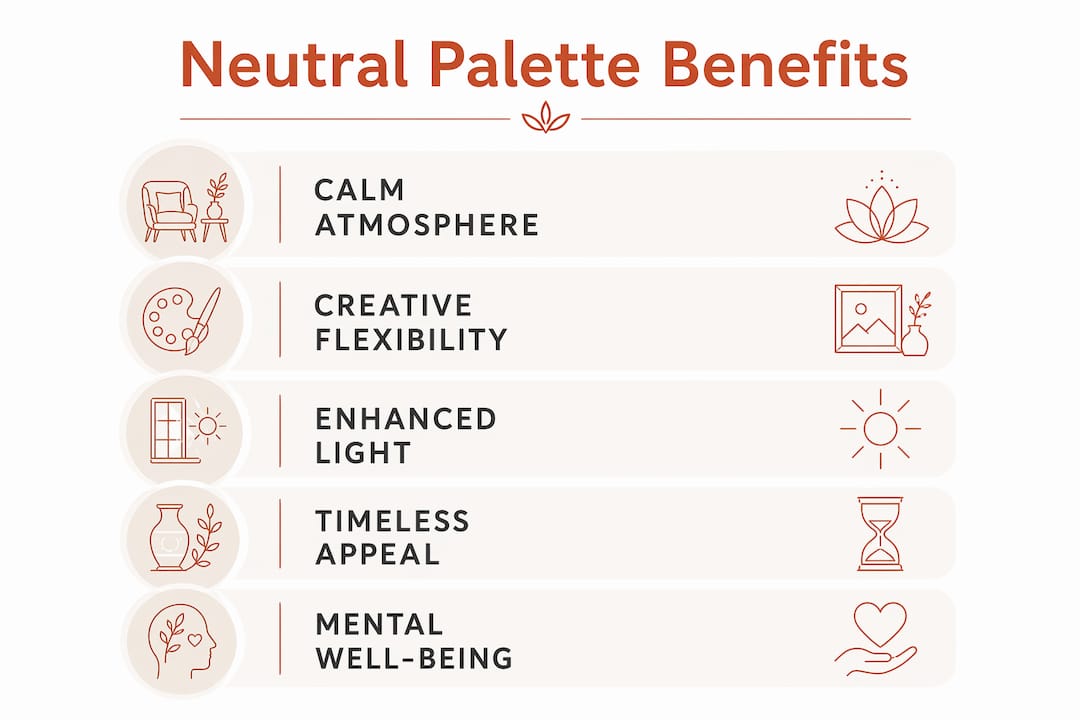
A neutral color palette at home delivers calm, versatility, and lasting appeal that bolder choices simply cannot match. Neutrals reduce visual clutter, reflect natural light, and give you the freedom to refresh your space without a full redesign. Here is a quick look at what makes them worth choosing:
- Calm atmosphere: Soft tones lower sensory stimulation and support relaxation.
- Blank canvas: Any accent color, texture, or furniture style works against a neutral base.
- Light enhancement: Lighter neutrals reflect both natural and artificial light, making rooms feel more open.
- Timeless style: Neutrals stay relevant through shifting trends, reducing the need for frequent updates.
- Resale appeal: Neutral interiors attract a broader pool of buyers and can support stronger sale prices.
- Mental well-being: Reduced visual noise supports focus, rest, and emotional balance.
1. How neutral palettes create a calm, tranquil atmosphere
Neutral tones work on your nervous system in a way that bold colors simply do not. When your brain enters a room painted in ivory, sand, or taupe, it does not need to work hard to process competing hues. That reduced effort lets your parasympathetic nervous system take over, lowering heart rate and reducing cortisol production.
Environmental psychology describes this state as Soft Fascination: the environment holds your attention gently without demanding active concentration. A tonal palette of beiges and creams is the clearest example of this principle in action. Your eyes move across the room with minimal effort, and your mind follows.
Research note: A 2021 Color Marketing Group study found that neutral tones contribute to a measurable sense of stability and peace in home environments.
Shade selection matters here. Cold grays or stark whites in poorly lit spaces can feel sterile rather than soothing. Warm neutrals like cream, camel, and earthy tones promote psychological comfort and coziness instead.
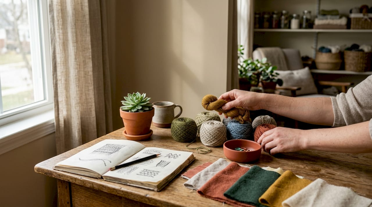
Pro Tip: Layer linen, wood, and woven textures throughout a neutral room. When color is quiet, texture becomes the thing your eye enjoys, and that tactile variety prevents the space from feeling flat or lifeless.
2. Neutral colors give you a flexible blank canvas for creativity
One of the strongest advantages of a neutral color scheme at home is how much creative freedom it hands you. Because the walls and large surfaces stay calm, every piece of art, every rug, and every throw pillow gets to speak for itself.
- Swap accent colors seasonally without touching the walls.
- Introduce bold artwork or patterned textiles without visual conflict.
- Move furniture between rooms freely since neutral paint never clashes.
- Experiment with minimalist, coastal, traditional, or modern cottage styles on the same base.
- Add metallic accents like gold or brushed brass for a contemporary touch without repainting.
Designers in 2026 consistently recommend neutrals as a budget-friendly foundation precisely because updates happen through accessories rather than structural changes. You refresh the mood of a room with new pillows or a different rug, not a weekend of painting and disruption. For more ideas on pairing styles, the living room color palette guide at Couchanddumbells walks through how neutrals anchor every major design direction.
3. How neutral tones enhance light, space, and cohesion
Lighter neutrals reflect both natural and artificial light more effectively than saturated colors do. That reflection makes rooms feel brighter and more open without any structural change. A cream or off-white wall bounces sunlight deeper into a space, which is especially useful in rooms with limited windows.
- Perceived size: A cohesive neutral palette blurs visual boundaries, making a room feel larger.
- Light amplification: Off-white and warm beige walls reflect light throughout the day as the sun shifts.
- Furniture harmony: Neutral walls pair with virtually any wood tone, upholstery color, or metal finish.
- Cross-room cohesion: Using a consistent neutral throughout an open-plan home ties separate zones together without effort.
Darker neutrals like charcoal or deep taupe work differently. They create a moodier, more enveloping feel while still softening the hard edges of a room. Both ends of the neutral spectrum enhance design coherence in ways that saturated colors rarely achieve.
4. Timeless appeal and easy maintenance with neutral palettes
Neutral colors do not age the way trend-driven choices do. A room painted in a bold color tied to a specific moment can feel dated within a few years. A warm beige or soft white simply does not carry that risk.
- Trend resistance: Neutrals remain stylish across decades, so you avoid the cycle of repainting every few years.
- Forgiving surfaces: Lighter neutrals hide minor scuffs and wear better than high-contrast colors, which highlight every mark.
- Lower long-term cost: Fewer repaints and redesigns mean real savings over time.
- Broad buyer appeal: Homes with neutral palettes tend to sell faster and at stronger prices, according to National Association of Realtors data.
- Decor flexibility: Seasonal changes happen through accessories, not paint, keeping disruption minimal.
Industry experts in 2026 regard neutrals as a top strategy for maximizing home market appeal in the United States. When a potential buyer walks into a neutral home, they can picture their own furniture and style in the space far more easily than in a room painted a strong personal color.
5. What research says about neutral palettes and mental well-being
The psychological case for neutral interiors goes deeper than aesthetics. Neuroscientific evidence shows that neutral tones reduce sensory overload and cognitive load compared to vivid, high-chroma environments. Bright, saturated colors demand significant neural energy, keeping the brain in a state of alert. A palette of ivory and sand lets the visual cortex rest.
| Benefit | Mechanism | Outcome |
|---|---|---|
| Reduced cognitive load | Less neural energy spent processing hues | Improved focus and mental clarity |
| Lower cortisol | Parasympathetic nervous system activation | Reduced stress and anxiety |
| Soft Fascination | Gentle attention without active concentration | Sustained relaxation |
| Biological optimization | Reduced visual friction across surfaces | Lower heart rate at rest |
| Mood stability | Neutral tones linked to peace | Greater sense of calm and balance |
Design insight: Warm textured neutrals are the dominant trend in 2026 precisely because they offer long-term comfort rather than short-lived visual excitement.
Neutrals also support what environmental psychologists call environmental agency: the ability to reshape your space to match your current mental state. A modular sofa in a warm neutral, for example, can shift from an intimate reading setup to an open social arrangement without ever clashing with the room’s palette.
6. How neutral walls showcase your room’s best details
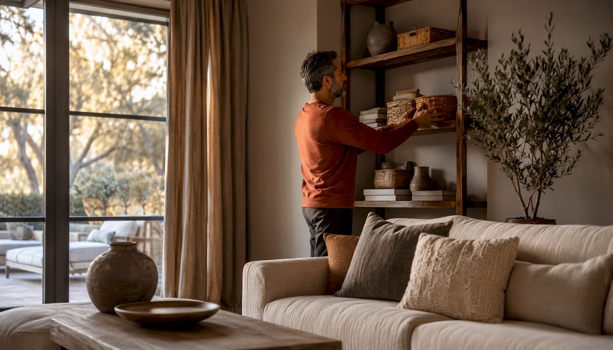
A neutral background does something that a busy or saturated wall cannot: it steps back and lets everything else come forward. Artwork, sculptural furniture, and architectural details like crown molding or exposed beams all read more clearly against a calm backdrop.
Think about a gallery. White walls exist for exactly this reason. The art, not the wall, is the point. The same logic applies in your home. A terracotta vase, a woven basket, or a statement chair becomes genuinely eye-catching when it does not have to compete with the wall behind it. Neutral interiors give your curated pieces the space they deserve.
7. Why neutral palettes pair so well with natural materials and textures
When color steps back, texture steps forward. This is one of the most practical advantages of neutral shades in interior design. Wood grain, linen weave, rattan, stone, and brushed metal all read with much greater depth against a neutral wall than they do against a competing color.
Natural materials also tend to carry their own warm, earthy tones. Oak reads golden. Linen reads sandy. Concrete reads cool gray. A neutral palette works in harmony with all of these because it shares the same low-saturation language. If you are thinking about how to blend fitness equipment or other functional pieces into your living space, the home decor blending guide at Couchanddumbells shows how a neutral base makes that integration feel intentional rather than accidental. For a wellness-focused space like a home yoga studio, designing with neutral tones creates the peaceful, distraction-free environment that practice requires.
Ready to bring a neutral, intentional aesthetic into your home? Couchanddumbells curates furniture and decor designed to complement exactly this kind of considered living. Browse the full home and interior collection to find pieces that work beautifully in any neutral space.
Key Takeaways
A neutral color palette at home reduces cognitive load, supports mental well-being, and creates a flexible foundation that adapts to any style or season without frequent redesign.
| Point | Details |
|---|---|
| Calm and well-being | Neutral tones lower cortisol and activate the parasympathetic nervous system, reducing stress. |
| Blank canvas flexibility | Swapping accessories refreshes a neutral room without repainting or major disruption. |
| Light and space | Lighter neutrals reflect natural light, making rooms feel brighter and more open. |
| Timeless and cost-effective | Neutrals resist trend cycles, reducing the need for frequent repaints and redesigns. |
| Stronger resale appeal | Homes with neutral palettes attract broader buyer interest and tend to sell faster. |
FAQ
What are the main benefits of using neutral colors at home?
Neutral colors create a calming atmosphere, reduce visual clutter, enhance natural light, and provide a flexible base for any decor style. They also support mental well-being by lowering sensory overload and cognitive load.
What color palette works best for most homes?
Warm neutrals like cream, beige, taupe, and soft white work well in most homes because they reflect light, complement natural materials, and appeal to a wide range of tastes without feeling sterile.
How do neutral colors create a timeless ambiance in home decor?
Neutral tones do not tie a space to a specific trend era, so they stay relevant across decades. Their understated quality lets furniture, art, and textures define the room’s character instead of the wall color.
What psychological benefits do neutral colors offer?
Research links neutral interiors to reduced cortisol, lower heart rates, and improved focus. Environmental psychology identifies this as the Soft Fascination effect, where a calm environment holds attention without demanding mental effort.